


In recent years, web traffic has primarily been handled by browsers based on three core engines (Blink, Gecko, and WebKit). These so-called modern browsers are developed and updated in an evergreen model, without the need for ‘manual’ updates (most often, updates occur ‘in the background’ during program restarts). This means that new features can be released more regularly.
As a result, the last few years have brought many exciting new features to the world of CSS, with some properties we’ve already become quite familiar with. I can’t imagine creating layouts today without Flexbox or CSS Grid. Recently, however, many interesting concepts developed by the CSS Working Group have also received support.
In this article, I will introduce five new features that will surely become a permanent part of the toolset I use daily. All of the described functionalities are supported by modern browsers, covering the majority of internet traffic.
Logical properties and values
Logical properties allow for better organization and consistency in the terminology related to element dimensions and text flow. Until now, we’ve used physical properties referring to the physical dimensions of the device. Logical properties and values, on the other hand, refer to the logical properties of the content being viewed. The keywords ‘inline’ and ‘block’ are defined through the vertical and horizontal direction of text flow. This makes it easier to solve problems related to, for example, changing the text direction.For instance, when adapting a template from an English-speaking market to Arabic or Japanese markets, we previously had to overwrite many properties to ensure that text written from right to left and its placement appeared correctly. The following example illustrates this well, where by using logical properties, we achieve the same visual effect while writing almost half the code, without the need to overwrite styles when the text direction changes.
An example written using physical properties:
An example written using logical properties:
A full list of properties and attributes that have logical counterparts can be found here: CSS logical properties and values
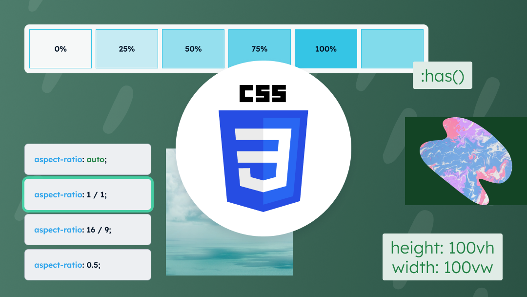
Dynamic units
Anyone who has tried to set the height of an element in such a way that it occupies the entire height of the visible screen has surely faced a problem for which we now have a solution. Using 100vh in such cases was never a fully correct solution, as on mobile devices it means 100% of the viewport height, including the address bar and other UI elements, which in most cases hide or show during scrolling.
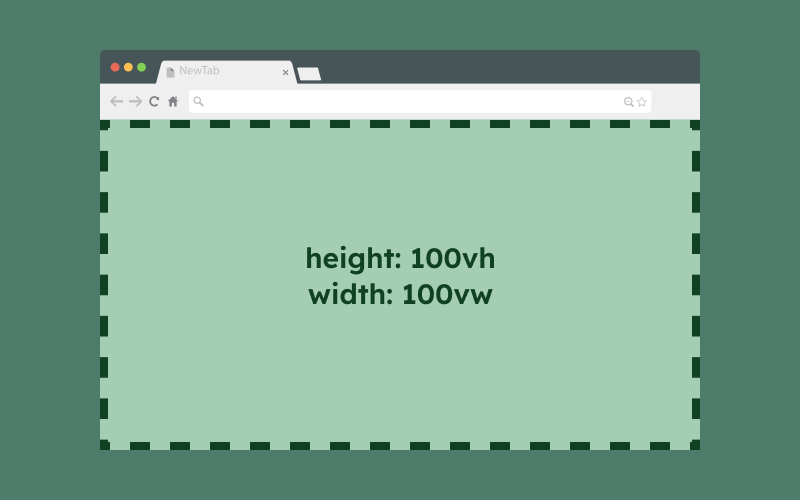

This causes our element to take up more space than we want. The new units come to the rescue:

- Small Viewport – corresponds to the size of the viewport when the browser UI elements are expanded. The units start with the prefix sv*:
- svh – height of the small viewport
- svw – width of the small viewport
- svb – height of the small viewport in a logical sense
- svi – width of the small viewport in a logical sense
- svmin – takes the smaller value between svh and svw
- svmax – takes the larger value between svh and svw
- Large Viewport – corresponds to the size of the viewport when the UI elements are hidden. The units are analogous to those of the small viewport, but with the prefix lv*
- Dynamic Viewport – takes the value of either the small or large viewport depending on whether the UI elements are visible at the moment or not. The units are analogous to those of the small viewport, but with the prefix dv*
It is important to remember that by default, the virtual keyboard is not considered part of the UI elements, so its appearance on the screen will not trigger a recalculation of the element’s size for which dynamic units have been used.
CSS Container Queries
Container Queries allow styling of elements based on the dimensions of a defined container. Until now, to change the layout of an element depending on its size, we could use media queries, where we defined within which viewport size the element should change. With container queries, we can change the layout based on the width of the element we are styling. In the era of components, this functionality can prove to be very useful. In the example below, we see the same element placed in different contexts, with the layout changing depending on the width of the individual elements.
To use container queries, we need to create an element that will act as a container for our element. It is important to note that this container cannot be styled inside the container query that refers to it. Here, we define the container and its type. Container queries that refer to the dimensions of an element can have the type inline-size (element’s width) or size (element’s width and height). There is also a normal type, which defines the container based on other properties of the element. This type of query does not yet have full support in browsers, so I will not expand on this topic in this article.
<div class="card-outer">
    <div class="card">[...]</div>
</div>
.card-outer {
    container: card / inline-size;
    /* this is a shorthand
    container-type: inline-size;
    container-name: card;
    */
}
With the container defined in this way, we can use it as follows:
.card {
    ...
    /* styles when container width is wider than 768px */
    @container card (min-width: 768px) {
        ...
    }
    /* styles when container width is wider than 992px */
    @container card (min-width: 768px) {
        ...
    }
}
With container queries, new units have been introduced that refer to the dimensions of the defined container. The units cqi | cqb | cqw | cqh | cqmin | cqmax correspond to the following: logical width | logical height | width | height | smaller value from the range of width and height | larger value from the range of width and height.
/* New container query units refering to size of the container: cqi | cqb | cqw | cqh | cqmin | cqmax */
.card {
    dispaly: flex;
    gap: 5cqi; /* -> 5% inline size of container */
}
Pseudo-class :has()
A long-awaited feature that allows us to write styles for a parent element based on its internal or adjacent elements.
A very common case was the custom styling of an input element of type checkbox. Until now, we usually used the adjacent sibling combinator ‘+’ to style the element immediately next to the input element. However, we can’t always change the markup.
With the use of :has(), we can do this more easily. The use of this pseudo-class doesn’t end here; I believe it will be widely used and will help us solve many problems more efficiently.
See the example at the link below:

CSS Cascade Layers
The concept of layers is an extension of the CSS cascade. Layers are positioned between selector specificity and inline styles. The updated CSS cascade is well illustrated by the image below:
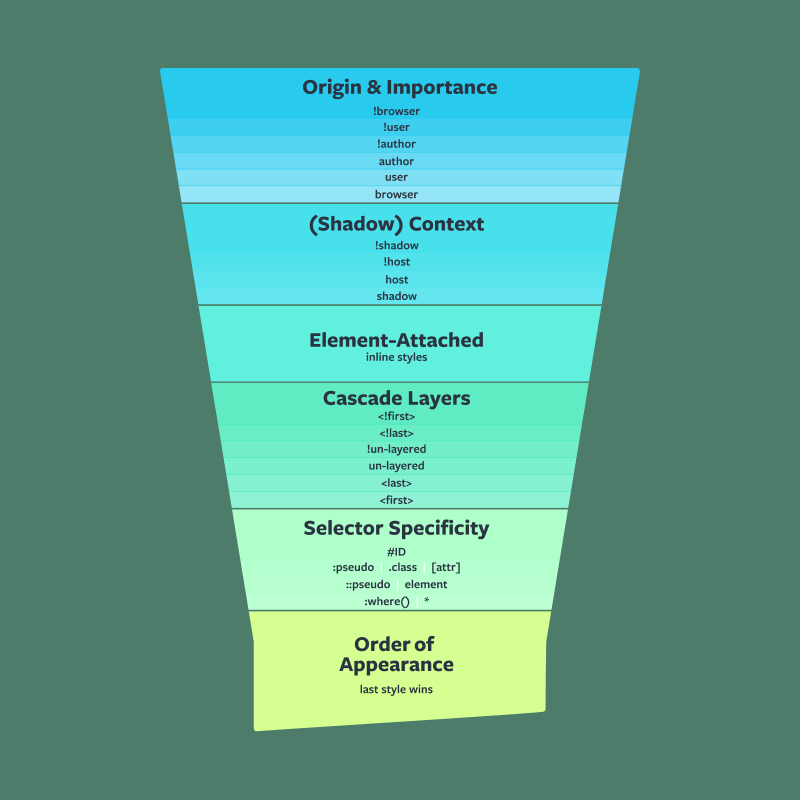
Basic assumptions and issues related to CSS Cascade Layers:
- The priority of layers depends on where they are defined, so it is recommended to define layers at the beginning of the document.
- Styles without a defined layer have a higher priority than styles within layers.
- We can import an entire stylesheet into a layer. This may be useful, for example, in the case of layer name conflicts.
- We can create multi-level layers.
- We can create anonymous layers – each such layer will be unique, and its order will depend on where it is used in the document.
- The keyword revert-layer (as a property value) allows us to “undo” the cascade and use any value defined in a previous layer.
Example of using CSS Layers:
Be cautious with the !important directive
When discussing priority, it’s important to mention the !important directive. In an ideal world, we shouldn’t need to use it, but we all know how things are in reality. In the context of layers, it’s important to remember that the priority is as follows:

This priority is analogous to the well-known style origin hierarchy, where the priority, as a reminder, is as follows:

The introduction of layers should significantly reduce the need for using the !important directive, but it’s still important to keep in mind the priority hierarchy presented above.
Tailwind and the @layer keyword
If you’ve ever used the Tailwind framework, you may have already encountered the concept of layers. In Tailwind, we can define styles within the base, components, and utilities layers. However, it’s important to remember that when using Tailwind, these three layers are not compiled as native CSS layers; instead, they refer to the @tailwind directive, which is used to ‘import’ Tailwind styles.. More about the @tailwind and @layer directives in the Tailwind framework. Learn how to effectively handle CSS layers and the @layer directive in Tailwind..
Other new features you can use today that are worth mentioning
- Native CSS nesting – native nesting in CSS (this functionality is used in the examples in the article)
- Pseudo-classes :is(), :where()
- CSS Masking
- text-wrap: balance
- color-mix function
- New color gamuts (lch, oklch, lab, oklab)
- Pseudo-classes :user-valid and :user-invalid for the input element
- subgrid – allows the use of a grid defined by the parent with display: grid
- aspect-ratio – the ability to set a fixed width-to-height ratio for an element
- text-underline-offset – the distance between the text and the underline
- accent-color – setting the accent color for certain UI elements like input:checkbox, :radio
- Trigonometric functions
- align-content for block-level elements
Summary
CSS continues its evolution, and the functionalities described above provide us with powerful tools. With them, we will be able to organize our code more efficiently, which should have an impact on the size of CSS files, and as we know, every byte is a valuable resource.
Bibliography and useful links
- Modern CSS in Real Life | Chris Coyier
- CSS Wrapped: 2023! | Una Kravets, Bramus, Adam Argyle
- CSS Nesting | Adam Argyle
- CSS Nesting | MDN
- An Interactive Guide to CSS Container Queries
- Say Hello To CSS Container Queries | Ahmad Shadeed
- CSS Container Queries For Designers | Ahmad Shadeed
- Style Container Queries | Una Kravets
- Future CSS: State Container Queries | Ahmad Shadeed
- A Complete Guide to CSS Cascade Layers | CSS Tricks | Miriam Suzanne
- Cascade layers are coming to your browser | Una Kravets
- :has | MDN
- Modern CSS for 2024: Use Cases for :has() | YOAV GANBAR
- CSS logical properties and values | MDN web docs
- The large, small, and dynamic viewport units | Bramus
- New CSS Viewport Units Do Not Solve The Classic Scrollbar Problem | Šime Vidas
- CSS Masking | Ahmad Shadeed
- mask | MDN
- inset | MDN web docs
- text-wrap: balanc
- e | MDN
- color-mix() | MDN
- OKLCH in CSS: why we moved from RGB and HSL | Andrey Sitnik, Travis Turner
- Modern CSS Solutions for Old CSS Problems | Stephanie Eckles