The guidelines of WCAG 2.1 are a key element in ensuring website accessibility for people with various types of disabilities. During the design process of the uczelniadostepna.pl website, we faced the challenge of ensuring accessibility for users with visual, auditory, and mobility impairments. Therefore, we had to take into account the diverse needs of people with disabilities and adjust them accordingly to make the website easy and intuitive to use for them.
In our work, we adopted an approach based on the principle of ‘accessibility from the start’. This means that we started designing the website with accessibility in mind, rather than trying to adapt it to the WCAG 2.1 guidelines at a later stage. As a result, we were able to effectively integrate accessibility principles at every stage of the design process, which allowed us to achieve a high level of accessibility quality on the uczelniadostepna.pl website.
The UX design process (structure and functionalities)
We started the UX and UI design by gathering project requirements. Our task was to understand the needs of users and the goals that the client wants to achieve. Next, we began working on the design concept, creating sketches regarding the structure and functionalities of the website. The design process was accompanied by regular discussions with the client. During these meetings, we discussed the progress of the work, presented our concepts, and agreed on next steps. The client also had the opportunity to express their comments and suggestions regarding the project. As a result, we were able to quickly respond to any client’s needs and adjust the project to their requirements.
After designing the overall layout of the website, we focused on designing interactions so that the user could easily navigate the site, use its features, and find the necessary information. We then created wireframes, which are simplified page schematics on which we marked where individual interface elements are located.
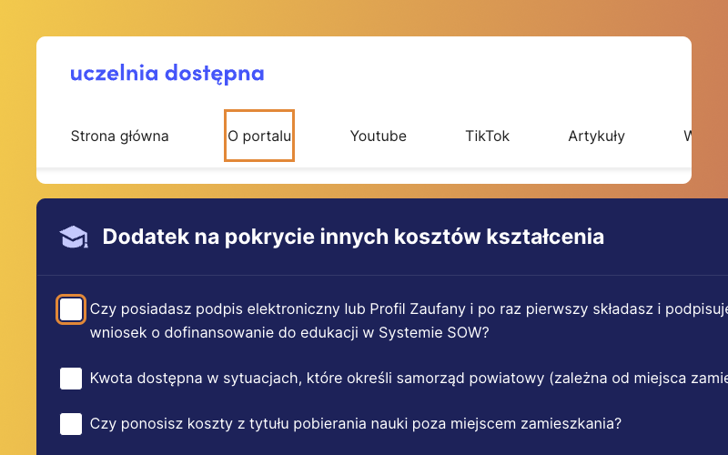
We paid close attention to navigation (Success Criterion 2.4.5). The main menu in the header allows for quick access to different parts of the website. Breadcrumbs enable users to track their location on the site and easily go back to previous pages, while a sitemap enables quick access to different sections of the website and helps users understand how they are related to each other.
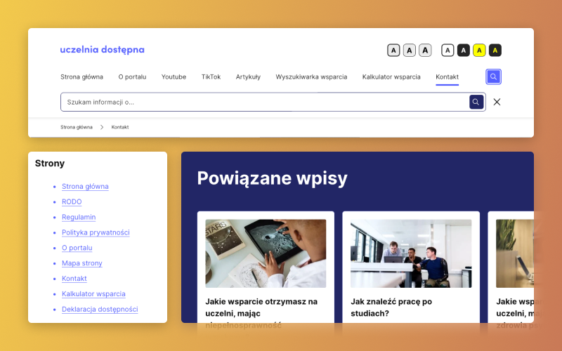
Related posts allow users to navigate between similar content, which is particularly important for those who are looking for information on a specific topic. This enables users to easily find the information they are interested in, which increases the website’s usability and positively impacts the user experience.
All of these navigation methods are important for ensuring the accessibility of the website and meet the guidelines of WCAG 2.1, which allows for easy use of the website by people with different needs and abilities.
Designing UI (visual layer)
Next, we focused on the visual design of the website, creating a style, colors, fonts, and graphics that would provide a consistent look and feel, as well as positive user experiences, and reflect the branding guidelines of the Association “Your New Possibilities”.
When designing the color scheme of the website, we focused on ensuring sufficient contrast between the text and interface elements and the background (Success Criteria 1.4.3, 1.4.6, 1.4.11). We opted for a color scheme in shades of blue and white. Additionally, we provided a high-contrast version.
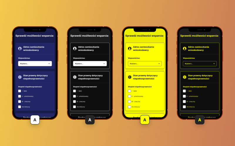
According to WCAG 2.1 guidelines, websites should provide the ability to increase text size without losing functionality or content (Success Criterion 1.4.4). Therefore, we used flexible units to determine the font size, allowing users to easily enlarge the text without losing legibility or distorting the content. We placed buttons in a visible location that allow users to increase the text size, enabling them to comfortably and intuitively adjust the font size to their needs.
Interface coding (Front-End)

Coding a website to meet WCAG 2.1 criteria required a focus on best practices for creating semantic HTML, using correct attributes, labeling forms, ensuring proper navigation and content accessibility, as well as applying contrasts and other visually-friendly patterns for users with various visual impairments.
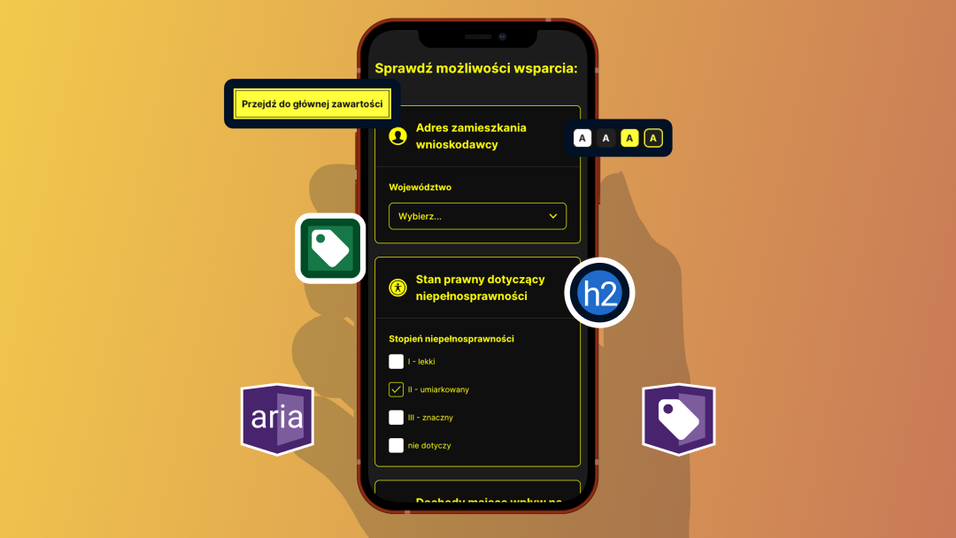
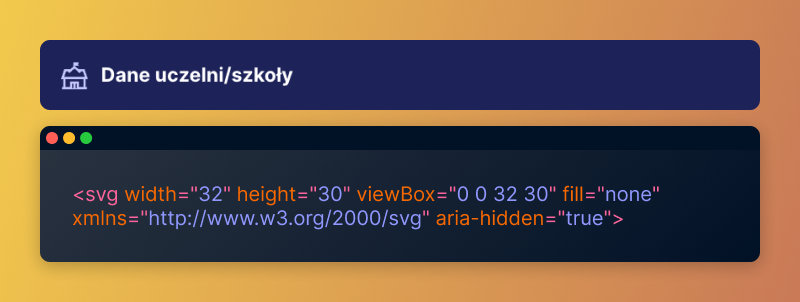
To meet accessibility standards, we applied a series of best programming practices. We focused on creating semantic HTML code that facilitates navigation and use of the website. We used H1-H6 headers to help users easily identify the level of hierarchy of a given text fragment and what it precisely conveys. Additionally, we also used many other semantic tags, such as <header>, <nav>, <main>, <article>, or <footer>, to precisely define the meaning of elements on the page (Success Criteria 1.3.1, 1.3.2, 2.4.6).
For example, the H1 header should only appear once at the top of the page, usually in the <header> section, and should contain the name of the page or the topic that the page is about (Success Criterion 2.4.2). The remaining H2-H6 headers should be used in the order that reflects the hierarchy of information on the page.
We used the <nav> tags to identify areas where navigational links are located, the <main> tag was used to mark the main content of the page, the <article> tag was used to label blog articles, and the <footer> tag was used to specify the footer of the page.
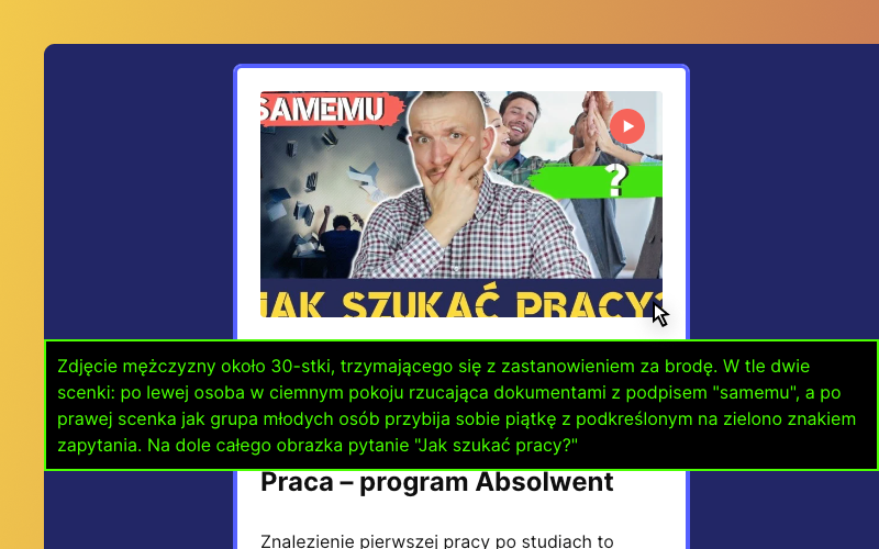
Furthermore, we made sure to add alternative descriptions to multimedia elements such as images and graphics, to allow users to access content that they are unable to see (Success Criteria 1.1.1 and 1.4.5).
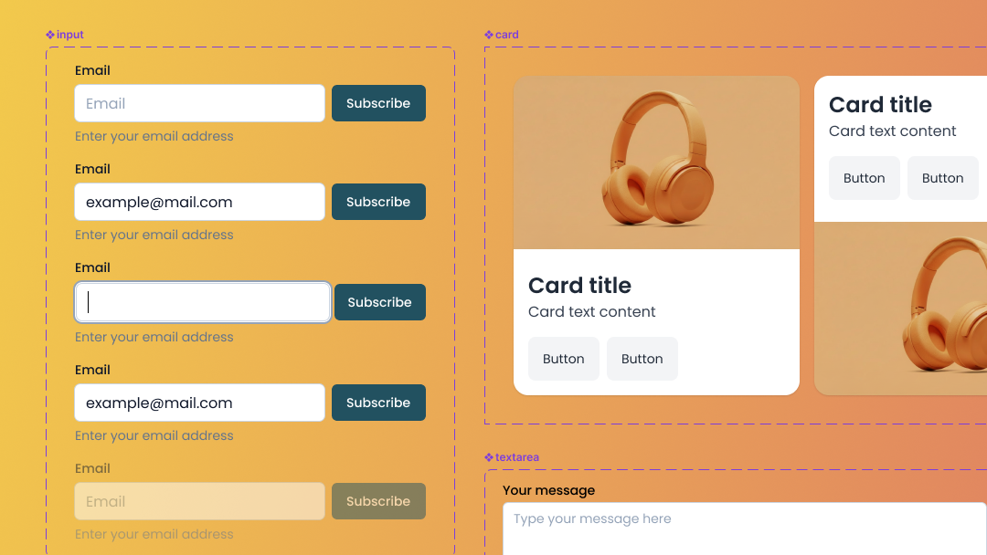
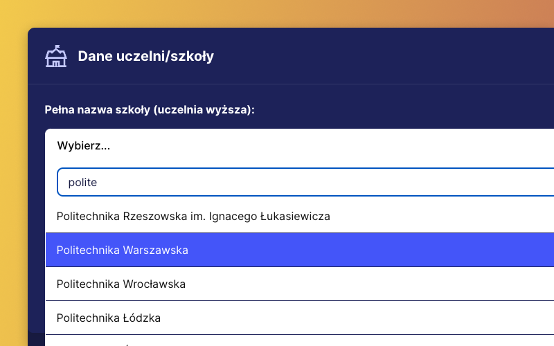
We also used form attributes such as <label>, <for>, <fieldset>, <legend> to label form elements and associate them with their labels, making it easier for users to fill them out.
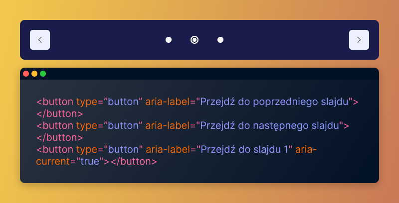
To describe interactive elements such as buttons and links, we used appropriate attributes such as aria-label, aria-describedby, aria-expanded, and aria-current.
We also took care to ensure proper visibility and indication of selected elements through focus (Success Criteria 1.4.13 and 2.4.7). This made it easier and more intuitive for all users to interact with the website.
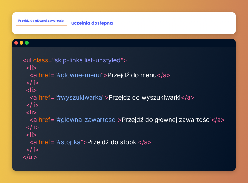
While creating the uczelniadostepna.pl website, we also implemented a range of other techniques aimed at making the site easier to use. In addition to the previously mentioned techniques, we also added “Skip links” (Success Criterion 2.4.1), which allow for quick navigation to important sections of the page, as well as mechanisms that assist in selecting the desired value for form elements, such as hints or data entry suggestions (Success Criteria 1.3.5 and 3.2.2).
Optimization
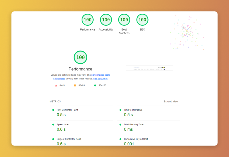
One of the basic guidelines for web accessibility is to ensure that the website is properly optimized for loading speed. This way, all users, regardless of their internet connection or device, will have fast and efficient access to the website’s content.
To achieve the best possible loading speed, we used techniques such as caching, lazy loading, optimization, and minimization of CSS and JavaScript code, as well as image optimization.
Tests
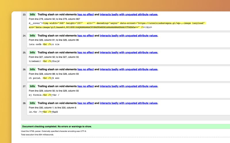
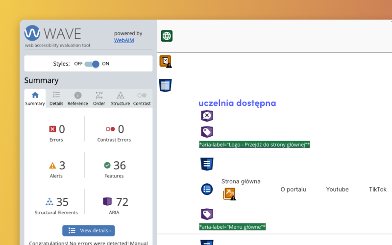
The last stage in the process of improving website accessibility was conducting accessibility tests to verify the results of our actions. We conducted tests using accessibility tools such as Wave, W3C Markup Validation Service or Accessibility Checker, as well as manual tests.
The tests included analysis of elements such as contrast, header consistency, HTML semantic correctness (Success Criterion 4.1.1), and accessibility for people using assistive technologies.
During the tests with the WAVE WebAIM tool, no accessibility errors were detected, which means that the website largely complies with WCAG 2.1 accessibility guidelines.
Summary
The design and implementation of the Uczelnia Dostępna portal website in accordance with the WCAG 2.1 guidelines was a great challenge for our company, but also an incredibly rewarding experience. We are proud that we could contribute to creating a better and more accessible internet for everyone.
If you want to learn more about creating websites compliant with the WCAG 2.1 guidelines, we invite you to read our articles: ‘WCAG compliance: introduction’ and ‘WCAG guidelines – levels and criteria’.
If you are interested in creating an accessible website, please contact us. Thanks to our experience and involvement in the Uczelnia Dostępna project, we are able to help you.