


A logical hierarchy of elements, consistency and predictability are just some of the terms relating to an accessible website. In this part of the article, I will introduce you to the success criteria for two levels of compliance with WCAG 2.1: A and AA.
Introduction
If you want to find out what WCAG is, I invite you to read the first part of the article. There you will learn general information about accessibility: what is it, who the rules apply to. In this section we will delve more deeply into the individual WCAG guidelines and WCAG levels.
WCAG 2.1 Level A and Level AA success criteria
Perceivable
1.1.1 Non-text Content (A) – content that is not electronic text, such as illustrations, diagrams, photos must have an alternative description (ALT text)
1.2.1 Audio-only and Video-only (Prerecorded) (A) – Audio-only (eg podcast, radio interview, etc.) – transcription of the recording is required; Video-only (no audio) or slideshow – requires a text alternative or audio description describing what the video shows;
1.2.2 Captions (Prerecorded) (A) – provide subtitles for non-live broadcasts. They should include both dialogues and relevant audio information. It is a good practice to turn on subtitles by default, with the option of hiding them.
1.2.3 Audio Description or Media Alternative (Prerecorded) (A) – prepare descriptive text transcript or an audio description, i.e. an audio recording describing the visual content. The content should contain both a transcript of the dialogues and a description of all relevant visual and audio elements of the recording.
1.2.4 Captions (Live) (AA) – provide captions for live broadcast recordings. They should include both dialogues and relevant audio information. It is a good practice to turn on subtitles by default, with the option of hiding them.
1.2.5 Audio Description (Prerecorded) (AA) – prepare audio description and add it to the main audio track. In short, audio description is an audio recording that describes the visual content. This criterion helps people with sight impairments understand video content.
1.3.1 Info and Relationships (A) – use semantic tags in accordance with their intended purpose (so that the screen reader reads the content on the page correctly and sequentially, also navigating the page using only the keyboard).
1.3.2 Meaningful Sequence (A) – Make sure the order of the elements on the page is also clear when CSS styles are disabled. Screen reader or keyboard-only users should be able to perceive the content in a logical order.
1.3.3 Sensory Characteristics (A) – navigation elements cannot be based only on sensory perceptions, such as color, size, shape of the element or its position on the page. Information should not be provided only in the form of icon or symbol.
1.3.4 Orientation (AA) – The website should display correctly both vertically and horizontally. However, there are exceptions, such as a piano app. In this case, the layout of the keys enforces the horizontal orientation of the device.
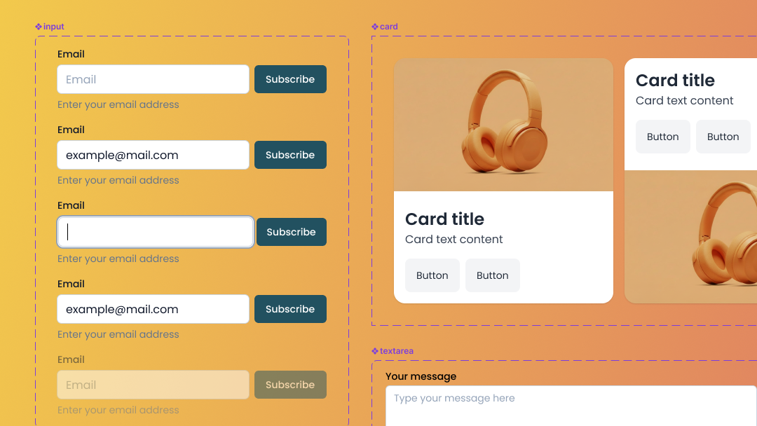
1.3.5 Identify Input Purpose (AA) – user input fields should have the “autocomplete” attribute added.
1.4.1 Use of Color (A) – color should not be the only medium of information. For example, an incorrectly filled form field, in addition to highlighting in red, you must also include a text error message. Another example are links. It is a good practice to mark hyperlinks by underlining them so that they will be clearly visible in the text.
1.4.2 Audio Control (A) – If the sound on the website starts automatically and plays for more than 3 seconds, you need to allow the user to pause / turn off the sound or adjust the volume. The mute sound control should be easily accessible so that people with a screen reader or keyboard can easily turn off the sound.
1.4.3 Contrast (Minimum) (AA) – text and text graphics (as .svg, .png, etc. files) should contrast with the background in the ratio 4.5: 1. When using large text (for example 18px), make sure that the elements have a minimum contrast ratio of 3:1. The rule does not apply to decorative elements, logos, and inactive interface elements.
1.4.4 Resize text (AA) – a website should be legible and functional after doubling the text size (200%).
1.4.5 Images of Text (AA) – if possible, avoid text graphics and use electronic text instead. Logotypes and elements of visual identification are exceptions. Add alt text to them.
1.4.10 Reflow (AA) – create a responsive website, the content of which will also be displayed in the width of 320 px without losing functionality and information and without using a horizontal scroll. In certain cases, horizontal scrolling can be used (e.g. complex tables, image carousel, maps, etc.)
1.4.11 Non-text Contrast (AA) – the contrast ratio of non-text UI elements (such as icons, inputs, buttons) to the background should be at least 3:1.
1.4.12 Text Spacing (AA) – use text spacing according to the following rules:
- line height – to at least 1.5 times the font size,
- spacing following paragraphs – to at least 2 times the font size,
- letter spacing – to at least 0.12 times the font size,
- word spacing – to at least 0.16 times the font size.
1.4.13 Content on Hover or Focus (AA) – the success criterion relates to the behavior of the interactive elements activated by the cursor or focus. Hover should be activated both when you mouse over and when navigating with the keyboard (TAB key). The content should be rejected after pressing the ESC key. The hover of an element should disappear when the cursor hovers over another element.

Operable
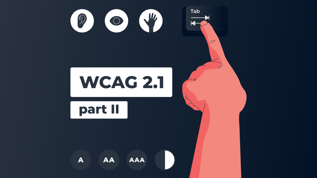
2.1.1 Keyboard (A) – all website functionalities should be accessible using only the keyboard or keyboard emulation readers. The user should be able to enter the link using the SPACE or ENTER key. Remember to clearly define the purpose of links and buttons. Avoid the phrase “click here”.
2.1.2 No Keyboard Trap (A) – make sure that you can both move the keyboard focus to the next interface element and remove the element focus by using the keyboard as well. An example is a pop-up that can be closed with the ESC key.
2.1.4 Character Key Shortcuts (A) – If a hotkey (activated by one key) is implemented in the content of the page, it should only be active after receiving the focus. It should be possible to change the shortcut or disable it by the user. Screen readers also have their own keyboard shortcuts, so it is important to avoid situations where the same shortcuts conflict with each other.
2.2.1 Timing Adjustable (A) – Avoid time limitations. If the time limit is necessary, allow the user to pause, turn off, or extend the time limit. There are also exceptions to this rule. There is no need to extend the time limit for completing the task that is at least 20 hours. Another exception is a real-time event, such as an online auction.
2.2.2 Pause, Stop, Hide (A) – Make sure that all elements on the page that move, animate and flicker for more than 5s and are activated automatically can be turned off, paused or hidden. If it is not necessary, avoid automatic page refresh. Make the user feel comfortable using your website. 🙂
2.3.1 Three Flashes or Below Threshold (A) – The success criterion focuses on people with photosensitive epilepsy. Make sure your website does not contain anything that flashes more than three times in one second or that the flash does not exceed the limits for general and red flashes. If you must add such media content to the site, add a warning, for example: “The material contains flashing images.”.
2.4.1 Bypass Blocks (A) – make it easier for users to quickly find the content they are looking for. Keyboard navigation requires passing through each interactive element. The criterion is met if there is a mechanism on the page that allows the user to omit repeated blocks of content (for example a list of links). It is a good practice to add a “Skip to main content” link at the beginning of the page, which is visible immediately after entering the page and pressing the TAB key.
2.4.2 Page Titled (A) – Each subpage of the website should have a unique title, describing its purpose or presenting its topic.
2.4.3 Focus Order (A) – When navigating with the keyboard, the focus activates the interface elements in a logical order.
2.4.4 Link Purpose (In Context) (A) – The purpose of the link (links, buttons) should be clear from the context in which the link is found. Avoid link text like “Click Here,” or “More”. If the page opens in a new browser window, inform the user about it (e.g. using the “sr-only” class).
2.4.5 Multiple Ways (AA) – A website should provide at least two different ways of reaching the subpages of the website. Below you will find some examples of such solutions:
- main menu in header / footer,
- site map,
- search engine,
- list of related pages,
- table of contents.
An exception to the rule is, for example, an online quiz. Only the answer to the question allows you to go to the next screen.
2.4.6 Headings and Labels (AA) – organize your content with headings and labels. Both should be semantic tags and define the topic or purpose of the content. Use labels to describe form inputs, don’t use placeholders in form fields. Remember that headings are very important for navigation.
2.4.7 Focus Visible (A) – The criterion is met when each interactive element gains visible focus when navigating with the keyboard. Don’t just rely on the default focus styles of your browsers as some of them don’t meet the accessibility criteria.
2.5.1 Pointer Gestures (A) – Provide a simplified alternative (single point touch) for options that require multi-point or path-based gestures (such as screen pinching, dragging). Here is an example of a solution: the map on a mobile device can be enlarged both by “pinching” the screen (multi-point gesture) and by pressing the plus button (single-point touch). However, there is an exception to the rule, such as an electronic signature.
2.5.2 Pointer Cancellation (A) – the criterion refers to clickable interface elements that are activated with a single point touch. At least one of the following is true:
- pressing the button (onMouseDown) does not trigger any part of the event,
- moving the cursor off the element (onMouseOut) or releasing the pressure undoes the triggered event and returns it to the state it was in before the event,
- clicking the button (onClick) takes you to the link purpose.
2.5.3 Label in Name (A) – The accessible name of a user interface element – the name that the user of the screen reader will hear should be consistent with the graphical interface.
2.5.4 Motion Actuation (A) – If the function on the page can be activated by the device motion (e.g. shaking, tilting the phone), it should also be operated by interface components (e.g. as a button). Activation by the device motion can be disabled by the user without losing website functionality.
Understandable
3.1.1 Language of Page (A) – The content of the website should be understandable by both people and technology. Set the lang attribute with the appropriate language tag in the HTML element (html lang = “en”) so that assistive technologies can read the page content in the correct language.
3.1.2 Language of Parts (AA) – If the website has also content in a different than the main language of the website, mark it properly. A screen reader will read it with the country-specific pronunciation. If in the text appears an abbreviation or jargon, it is worth adding a footnote at the end of the text explaining what it means. It is also good practice to add the phonetic pronunciation of a foreign word in brackets.
3.2.1 On Focus (A) – make sure that taking focus by any UI component does not cause unexpected change of context and the focus itself does not trigger an action (only after clicking the SPACEBAR or ENTER by user).
3.2.2 On Input (A) – the data entry process should be predictable. Filling out a form or selecting a checkbox should not change the context or automatically send data until the user clicks the confirmation button. If the functionality of the website requires otherwise, the user should be informed in advance about such action.
3.2.3 Consistent Navigation (AA) – Maintain a consistent order of elements that are repeated on the subpages of the website. It is best to get the user used to a certain pattern so that he or she can easily find the element of interest while navigating the site. The exception is when the user makes changes to the content layout by herself/himself.
3.2.4 Consistent Identification (AA) – Label components that have the same functionality in a similar way. Use labels, names, and text alternatives consistently.
3.3.1 Error Identification (A) – Clearly mark the required fields on the form. Inform the user which element needs to be corrected if there is a mistake. Use aria-invalid to identify failed fields.
3.3.2 Labels or Instructions (A) – a good solution is to add a short description of the required format of the data that needs to be entered (for example, date format). Don’t use placeholders in input, but add labels to form fields.
3.3.3 Error Suggestion (AA) – if the website detects an error of the user input in a form field, for example, the “@” sign is missing in the e-mail field, suggest a correction. The only exception are situations in which suggestions would endanger data security (e.g. in online banking) or change the purpose of the content.
3.3.4 Error Prevention (Legal, Financial, Data) (AA) – Web pages on which the user makes financial transactions, concludes agreements, modifies personal data or performs tests should be provided with mechanisms for checking, confirming, correcting and withdrawing actions by the user.
Robust
4.1.1 Parsing (A) – Make sure that the HTML and CSS codes are semantically correct . Check if the elements have opening and closing tags, if they are correctly nested in the HTML document and if they do not have duplicate attributes. See if all IDs are unique.
4.1.2 Name, Role, Value (A) – HTML elements should have an appropriate name. If you create new, non-standard interface elements – define their role, name and status.
4.1.3 Status Messages (AA) – Notifications and status messages should be tagged with the appropriate role or property using ARIA tags. Thus, the user using a screen reader will receive a status message: error, success or progress, no matter where he/she is on the website.
In this part of the article, you have read the brief description of the WCAG 2.1 guidelines. Due to the number and detail of the rules, I’ve only mentioned the requirements for two compliance levels: A and AA. I’ve omitted the success criteria for the AAA level. For a full dose of information please visit www.w3.org/TR/WCAG21.
We sincerely hope that this article will prove helpful for you. If you have any comments, please let us know on our Facebook fanpage 🙂