Design and web development – Smultron team has put together a helpful series of guidelines that can help any web design company put together a website and prepare design files for developers. This article will mainly focus on Adobe Photoshop and Adobe XD developer handoff.
Web design and web development are two complementary areas that separate teams work on. We have created an article that can help you communicate between these two worlds.
PSD / XD / Sketch files
If designing layout for web with Photoshop, separate psd files should be provided for each subpage. It must be ensured that there are no unnecessary layers or files linking to external libraries. Each file’s layout structure should be clear to make the programmer’s life easier and avoid any misunderstandings.
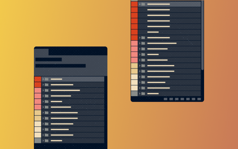
If working in XD, the web design should be sent as a link available with the Handoff Design Specs function. This action ensures the programmer can read the element parameters to be encoded and/or download the assets. To enable this, select: Share for development> Include Assets for Download. Remember to ungroup elements that do not constitute a whole (e.g. they are not an icon composed of several shapes) before exporting.
If you are creating projects in Sketch, it is worth using the Zeplin plugin. It improves communication between web design company and web developers, and enables asset export.
RWD versions
The current standard is to create pages using the Mobile First approach. This strategy makes it easier to achieve consistency between mobile and desktop versions. It is worth preparing views for various sizes: 320 px, 768 px, 1280 px and 1920 px. Versions for different sizes should be consistent between each other.
Fonts
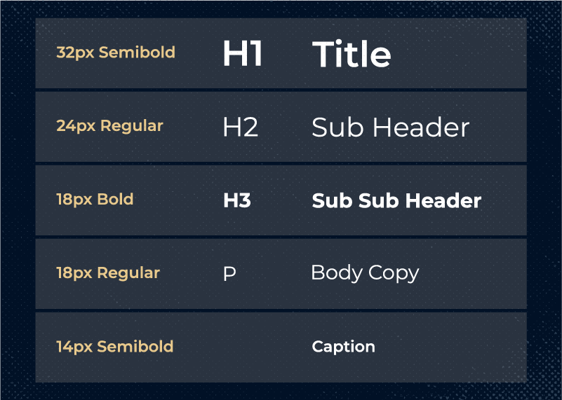
The web design development company should provide a comprehensive list of the fonts used and their sizes (h1 / h2 / etc.). Text sizes throughout the project in each view (mobile, tablet, desktop) should be used consistently as well.
If you are using custom fonts, a font package is required. However, we encourage you to use Google Fonts. This library offers a wide selection of fonts and allows users to check the appearance and availability of specific characters in advance. The fonts are open source licensed, so they can be used for both private and commercial purposes. To use Adobe Fonts you need to have a monthly or annual Creative Cloud subscription. Otherwise, you should purchase a one-time license for each typeface (regular, italic, bold, etc.).
Gaps/distances
Keep unified gaps between elements (padding, margin). Both of those elements, as well as all element heights (and if possible widths), should correlate with the line height of the text (e.g. 1.5 * line height).
Colors
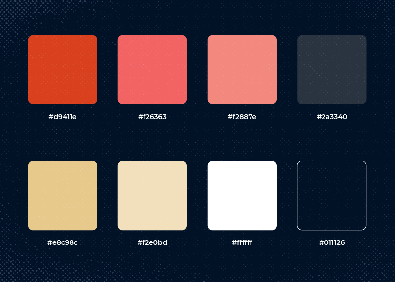
To keep the project consistent you should provide the programmer with a color palette (a list of colors to be used on the website).
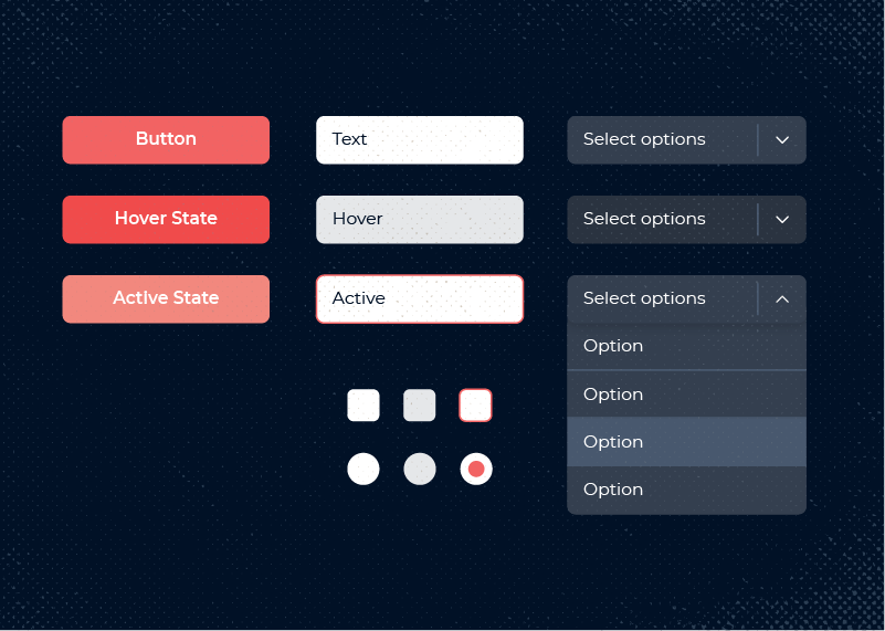
That list should also include active previews for clickable elements (for instance buttons):
Icons
When designing a website, icons or vector illustrations are often created. If designing in Photoshop, no elements should link to an external library (e.g. Illustrator) that isn’t directly available from the project.
In this scenario, it would be better if the vector elements in the files were Photoshop shapes or the vectors were saved as svg files and delivered in a separate .zip folder. A single svg file should be clean and contain only the correct vector icon.
Raster graphics/photos
Pictures or raster graphics should also be sent in a separate catalog with a description. Avoid accidental file names. Do not use diacritical marks and special characters. Write a brief name for each picture and use dashes. For instance, an appropriate name for a photo file would be photography-wawel.jpg, not uoiałflklal.jpg. It is also worth remembering to provide optimized, high resolution files. If you are using a Mac, use the free tool ImageOptim (www.imageoptim.com). At www.pngquant.org you will find a version for Windows or a Photoshop plug-in. Save traditional photos in jpg format, while illustrations and infographics should be saved in png format.
Animations / interactions
If you have a separate file with hovers / interactions, it is advisable to mark where which element appears. Is there an invented or selected hover effect? To get the animation style as close as possible, it is worth describing in detail all interactions and moving elements. You can also send a link to the example. In the event of more complex animations – it is useful to describe the entire animation sequence, ( e.g. the animation lasts 2 seconds, starts with the movement of one element, and at the 0.3 second mark the second element appears).
Additional layout elements
There are few more design elements to consider. Check the list below.
Sample text page
This may not be a main webpage, but it is still important due to the elements that appear in it. These elements can be used in the future for text editing in CMS. A properly prepared text page should consist of text that includes: headings, citation view, a numeric list, a bulleted list, a link , or caption to a photo.
Error 404 subpage
This page is absolutely necessary for any website, but hopefully users will never see it ?. However, sometimes Error 404 pages are encountered due to actions totally beyond the web designer’s control. For example, someone may enter an incorrect URL; in this scenario an Error 404 page would appear. Make sure that it is visually consistent with the rest of the subpages.
Cookie banner
The cookie banner will be displayed during each users’ first visit to the site.
Messages and validation
Messages and validation mainly apply to forms and search engines. Prepare the style of error / success messages and appearance of the active fields in the form.
Additional information for coders
If you want to have specific dimensions for any element on a page (e.g. a specific height), you need to tell the web developer. A precise description or a link to an example from another page can also be very helpful if something can’t be shown in the graphic file.
Favicon
Last, but not least, prepare a favicon – a small icon that helps to identify a web page. This can be done by using the online tool: www.realfavicongenerator.net. First, upload the graphic in .png, .jpg or .svg format. You will then get a package with icons and HTML code that can be sent to the web development agency.
We sincerely hope that this article will prove helpful for you. If you have any comments, please let us know on our Facebook fanpage 🙂


