


- Component and settings repository for modules
- Room for improvement:
- Responsiveness and Breakpoints
- Possible improvements:
- Typography and text hierarchy
- Possible improvements:
- Component consistency and design hierarchy
- Possible improvements:
- Reducing compositional dependencies
- Practical compromises for easier implementation:
- Grid system
- Possible improvements:
- Maintaining Element Contrast (WCAG Compliance)
- Practical tip:
- Key Takeaways
A well-structured interface layout plays a crucial role – not just in the visual appeal of a project, but also in how smoothly it can be implemented and maintained over time. From a developer’s perspective, the most common issues stem from inconsistent design rules, unpredictable responsive behavior and an overload of small exceptions that significantly complicate the codebase.
In this article, we’ve gathered practical developer-oriented tips on how to create layouts in a more systematic and predictable way – making them easier to implement, more scalable and striking the right balance between creative design and efficient coding.
Component and settings repository for modules
A well-prepared component and settings repository helps maintain visual consistency and simplifies the coding process. It typically includes color palettes, typography scales, icon sets and the smallest reusable components that recur throughout the project.
Room for improvement:
Ideally, this repository should be updated alongside the project’s evolution and treated as the single source of truth for all available variants – following an approach like Atomic Design, for instance. This makes it easier to justify new variants and keep their number under control.
Responsiveness and Breakpoints
A layout prepared in three versions (mobile, tablet, desktop) often fails to show what happens between those views – and that’s exactly where most problems arise in practice. Elements may overlap or lose their sense of rhythm, proportion and composition if their scaling behavior hasn’t been anticipated. A lack of logical continuity between views makes implementation harder and forces developers to write numerous exception rules in the code.
For example, at narrower screen widths, an illustration with characters might get cropped or overlap with the text – depending on the chosen scaling approach.

Possible improvements:
- Adding comments to the design file in areas that may behave unexpectedly between the designed breakpoints – for example, how an element should scale, what should always remain visible and so on.
- When designing, it’s worth thinking about fluidity between views – how an element transitions as the viewport width increases, rather than only how it looks at three fixed screen sizes. For sections with unusual proportions, it’s helpful to anticipate their adaptation – for instance, how text repositions relative to an image as the available space shrinks or expands.

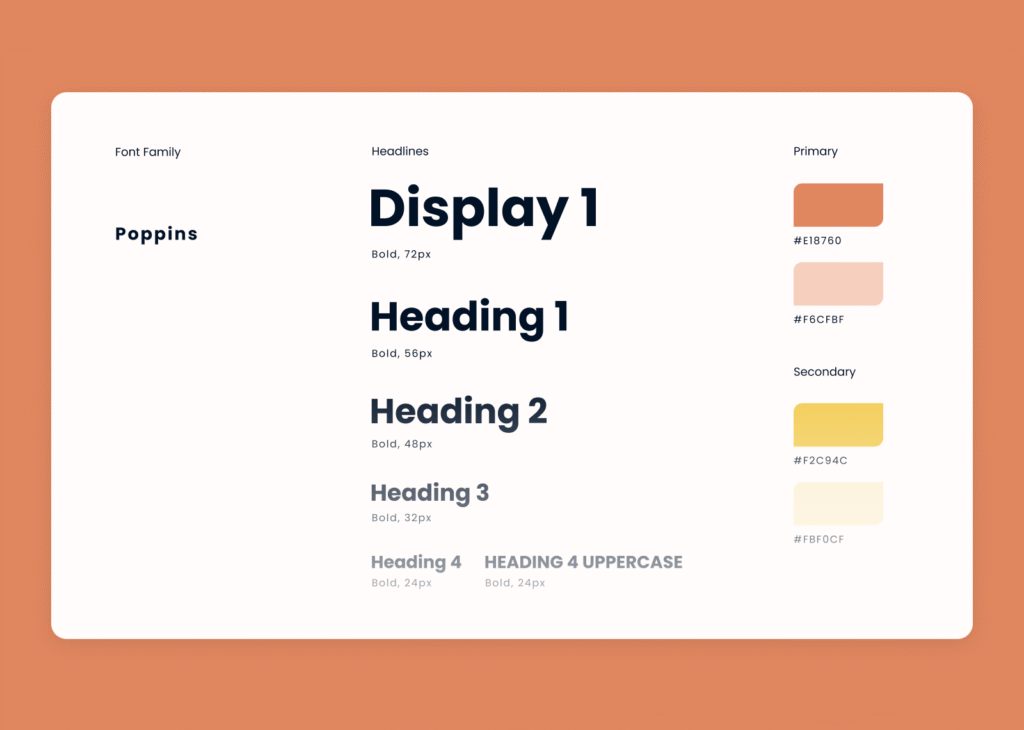
Typography and text hierarchy
In many projects, we notice an excess of different font size and line height combinations, which makes it difficult to maintain a clear hierarchy and visual consistency within the typographic system.
Possible improvements:
Introducing a limited, well-defined set of text styles – applied consistently across the entire project – would help establish a clear hierarchy and reduce the overall amount of code. It’s a trade-off between visual variety and efficiency of implementation and maintenance.
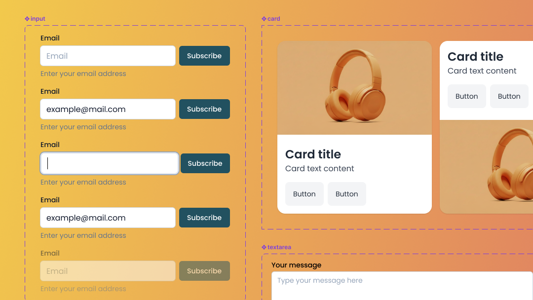
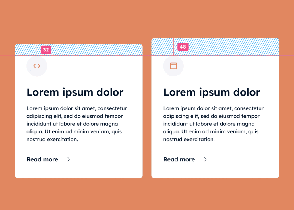
Component consistency and design hierarchy
It often happens that elements look similar but differ in small details – spacing, margins, font sizes, or border radius. These micro-differences generate additional component variants and CSS classes, increasing code complexity, extending implementation time and making the codebase harder to maintain.
Possible improvements:
- Consider introducing a structured component hierarchy – for example, following the Atomic Design methodology (Atom → Molecule → Organism) or other consistent rules.
- Unify the spacing scale – use repeatable margin and padding values tied to the grid and typography. Text-related spacing (margins) can be proportional to font size, e.g.,
font-size × 1(1 em),font-size × 1.5(1.5 em) and so on.
This ensures a consistent vertical rhythm and makes element placement more predictable across different screen widths.
Such an approach allows teams to:
- more easily identify which changes create a genuinely new component variant versus what’s simply a minor inconsistency;
- increase modularity and the potential for reusing components across different parts of the codebase;
- shorten implementation time and reduce the amount of code that needs ongoing maintenance.
It’s a trade-off between unrestricted design freedom and the efficiency, scalability and maintainability of the project.
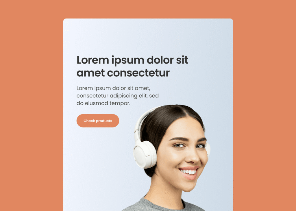
Reducing compositional dependencies
Elements that combine text with a graphic background and only look correct at a specific viewport width or with a particular amount of text are the hardest to implement. Fine-tuning such layouts usually takes considerable time and achieving a correct appearance at every screen width may be impossible – or can break after adding more content through a CMS.
For instance, additional lines of text added via CMS could overlap a person’s head in the illustration, while on wider screens – if the graphic scales proportionally – the head might slide under the text.
Practical compromises for easier implementation:
- Using a neutral background for key sections and visual elements helps avoid rigid dependencies between text and graphics that can complicate layout scaling.
- If a graphic must remain in relation to the content, consider separating it as an independent element in the layout. This allows it to be positioned independently from the text, preserving readability and layout flexibility. It’s a compromise between a fixed, compositional layout and a fluid, responsive page structure.
Grid system
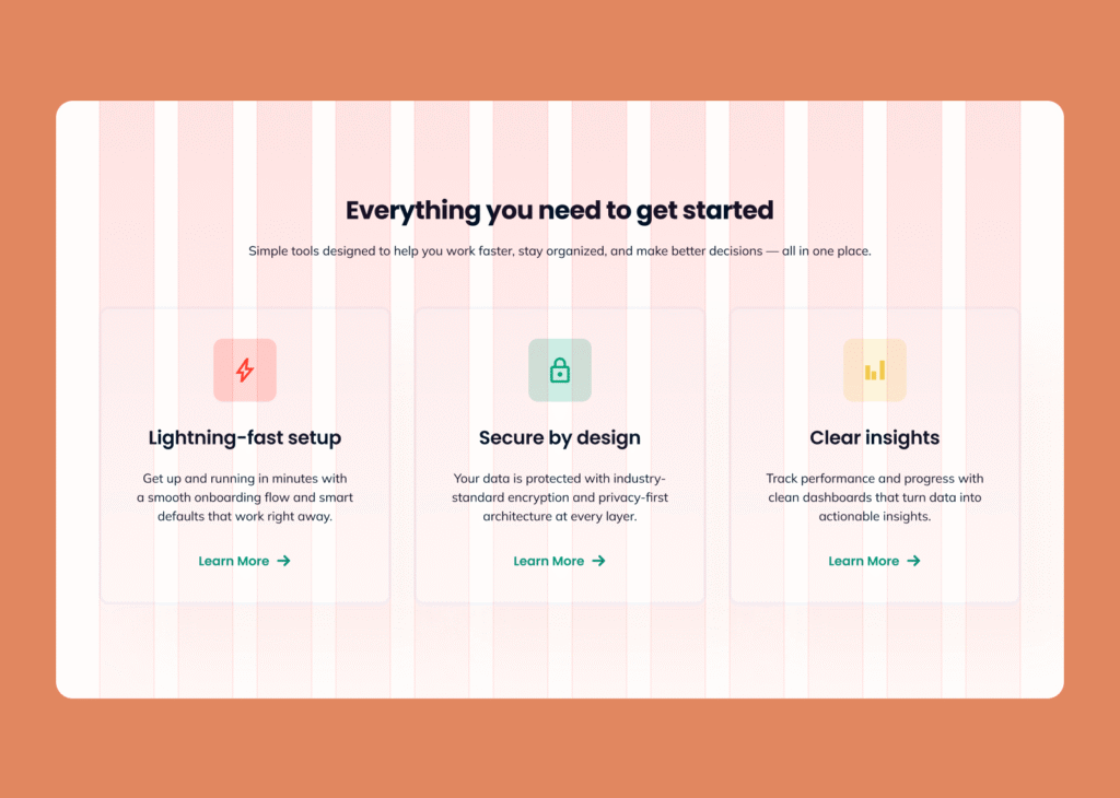
Using a column grid as the foundation for building layouts, arranging modules and setting spacing between them simplifies responsive layout coding based on a chosen CSS grid system. The outermost grid lines define the layout boundary, which is subject to scaling and responsive adjustments. In code, you can instruct an element to span 12 columns on mobile, 6 columns with a 3-column offset on tablet and 4 columns on desktop and so on.
If individual sections are designed independently – with varying widths, margins and spacings – each of those layouts requires a separate, custom implementation in code.
Possible improvements:
- Use a single, shared grid for the entire project (12 or 16 columns with 24–32px gutters) or any other positioning rules that establish a coherent system for placing elements and reduce layout randomness.
- Keep sections and components within that grid (or other established positioning rules) rather than creating unique layouts for each module or page – and document any exceptions. With a 12- or 16-column grid, avoid dividing into column counts that aren’t evenly divisible, such as a module spanning 5 columns.
- Design exceptions (e.g., full-width sections, banners, or background elements that extend beyond the main layout) in a way that still maintains a visual connection to the grid for the content area.
This approach simplifies responsive layout development, shortens implementation time and reduces the resulting amount of code, since the page structure relies on shared rules. It’s a trade-off between full compositional freedom and a predictable, easy-to-maintain design system.
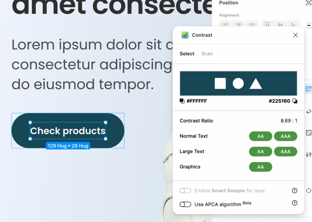
Maintaining Element Contrast (WCAG Compliance)
When designing, pay attention to contrast between interface elements – text, backgrounds, buttons and icons. This makes the design more readable and accessible to a wider range of users. Follow WCAG guidelines: a minimum contrast ratio of 4.5:1 for standard text and 3:1 for non-text elements and large or bold text.
Practical tip:
You can quickly check contrast using online tools like Contrast Checker or plugins for Figma and Adobe XD.
Key Takeaways
A well-planned layout is built on consistent rules and thoughtfully designed components. This makes the layout flexible, readable and easy to maintain – and makes the entire development process simpler and more predictable.
We hope you find the tips in this article useful. If you have any feedback, feel free to leave a comment on our Facebook page 🙂